One app, shaped by what you hold
Creditas is a Brazilian fintech built on secured lending, with employee benefits, insurance and other financial products around it.
- Role
- Senior Product Designer — discovery, information architecture, interaction design, prototyping, documentation, handoff and QA.
- Collaborators
- PM, Engineering (web/iOS/Android), Risk & Compliance, Data/Analytics, CRM/Growth, CX/Support, Operations, Legal.
- North star
- The app is how a company’s employees meet the rest of Creditas, so it has to be a place people come back to and manage what they hold, not a form they fill once.
In 30 seconds
- 01 · Problem
- The app needed to support a growing portfolio of loans, benefits and insurance while keeping existing products easy to manage.
- 02 · Decision
- Organize the home around customer context, with dedicated areas for the products they already hold.
- 03 · Result
- Activation 17% → 26%; Management 2% → 12%, reported in the project review.
The problem
The app needed to support a growing portfolio of loans, benefits and insurance while keeping existing products easy to manage.
The interface behind the structure
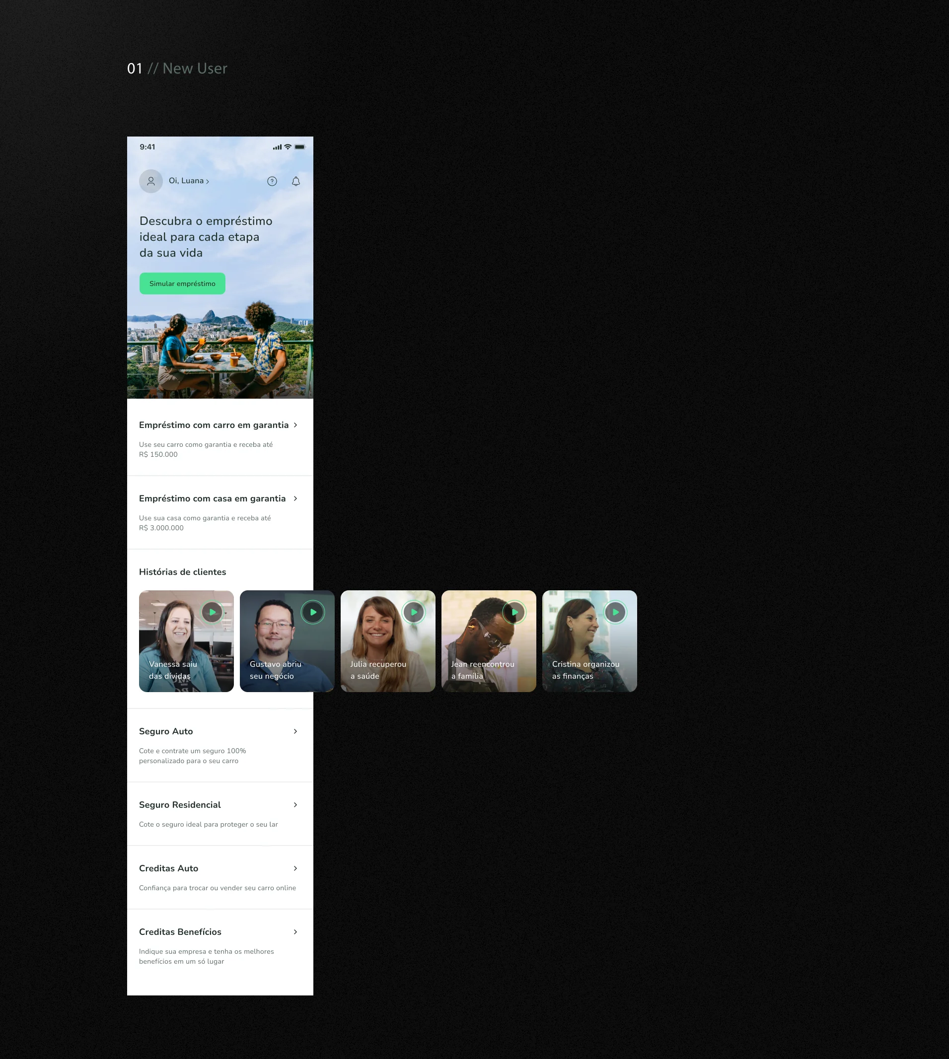
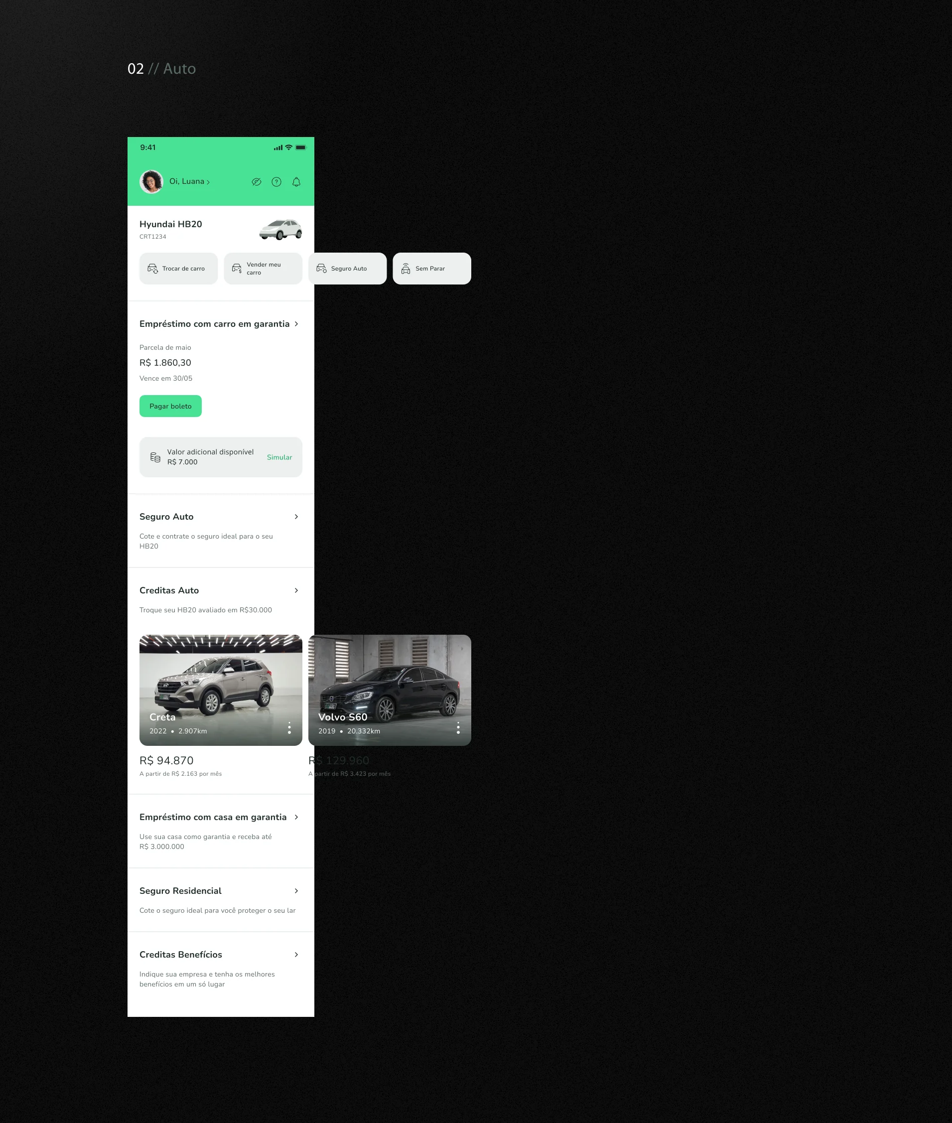
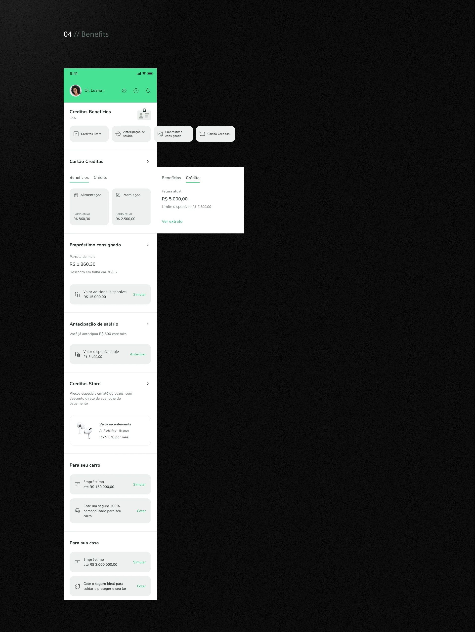
Original project exports: a new customer discovers products; an existing customer manages a car loan; an employee sees benefits and card balances. These screens show different customer contexts, not a before-and-after test.
Discover products
Manage a car loan
Manage benefits
The constraint
The app was not broken, which is the hardest brief. It worked for the product someone already had, and every new Creditas offering made it heavier: information about loans, cards, benefits and insurance living in separate corners, each team wanting room on the home screen. Nothing could be taken away from existing customers while it was made lighter.
The design decision
The exported designs show different starting points for new customers, car-loan customers, homeowners and employees with benefits. Each combines the relevant products and management actions with opportunities to discover other offerings.
The trade-off
Contextual home screens add design and maintenance work: shared components need to support different products, balances and next actions. Consistency across these contexts matters as much as personalization.
Outcome
- The target, set by the business
- In 2023 Creditas was working towards breakeven, and one of the key results was to raise the repetition conversion rate by at least 50% by the end of the year. The app was the main way to get a company’s employees onto higher-margin products, and we knew we were bad at the managing half of that.
- The funnel, before and after
- Awareness 49% → 52%. Acquisition 31% → 33%. Activation 17% → 26%. Management 2% → 12%. The baseline came from the squad’s PM and engineering lead, and the figures are from the project’s own review.
- What that means
- Activation rose from 17% to 26%, and Management from 2% to 12%, as named in the project review. Management is not a retention measure. The available material does not establish the full measurement window, denominator or design-only causality. No result is available for the repetition target.